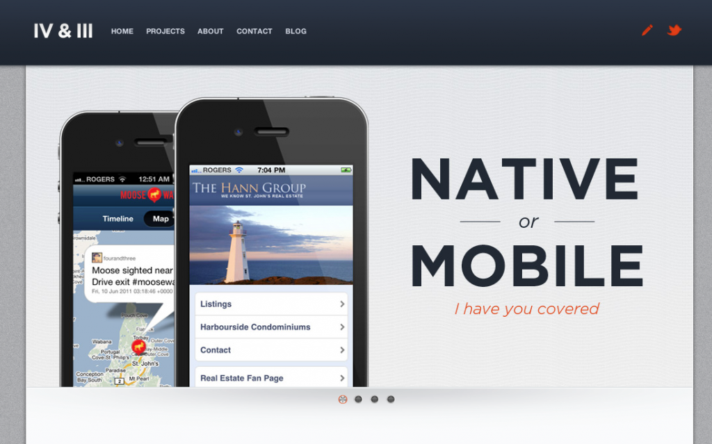
Increase the amount of white space.
Line25.com, which has over 60,000 readers of their blog, features weekly highlights of outstanding website designs. I am not a web designer but I do recognize one characteristic that EVERY site shares: white space.
Check out fourandthree.com
And giftrocket.com
Now go to your website and audit the percentage of white space it has compared to these sites. You do not have to spend thousands of dollars hiring a quality designer but you can:
- Remove widgets, icons, or images that do not provide much value to the people you are targeting.
- Design a different banner that has more whitespace: often times banners includes lots of people, text and graphics all smashed together. Think about one person, one color, one font, and LOTS of background space as an alternative.
- Remove multiple navigation bars: Many websites have two navigation bars: a site navigation (Home, About, Give) and a content navigation (sermons, audio, bible study resources, etc). Consider merging these navigation bars to free up space and simplify options for your visitors.
Here’s why you should think of white space as PART of the design, not the canvas beneath it:
White space should not be considered merely ‘blank’ space — it is an important element of design which enables the objects in it to exist at all, the balance between positive (or non-white) and the use of negative spaces is key to aesthetic composition.–wikipedia
I recently removed two widgets from my blog. Here’s to a clutter free website!


